User-created pages can be edited in several ways using the Screen Manager module.
Use the screen manager module to:
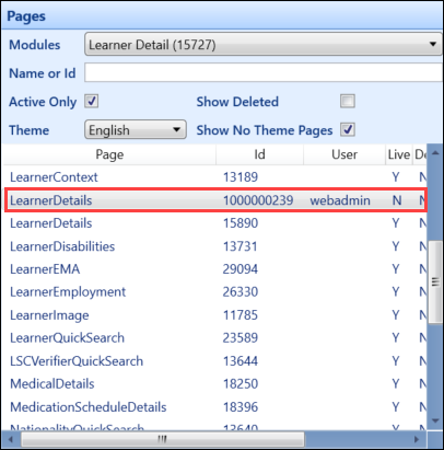
Use the fields in the Pages panel to search for relevant pages.

The fields on the Pages panel are described in the following table.
| This field | Holds this information... |
|---|---|
| Modules |
Lists all modules. Selecting a module displays all pages within that module. Important.You must select a module from the drop-down list to enable the remaining fields.
|
| Name or Id | Allows you to filter the pages by name or Id. |
| Active Only | Whether active pages are displayed. |
| Show Deleted | Whether deleted pages are displayed. |
| Theme |
The page theme. These are, in effect, regions. Important.There are different themes in Central, Shape and EBS4 web.
|
| Show No Theme Pages | Whether to display pages that do not have a theme. |
-
Search for and select the inherited page you want to add a column to from the Pages list.
-
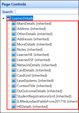
Select the control you want to add a column to from the Page Controls panel.
-
Select the Add Column button in the Page group of the System Configuration Commands ribbon.

The column is added in the relevant page control.
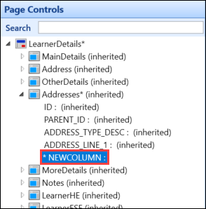 Important.You can change the order of the columns in a control by selecting and dragging a column to a new position.
 -
Enter the details for the new column in the Column Details panel.
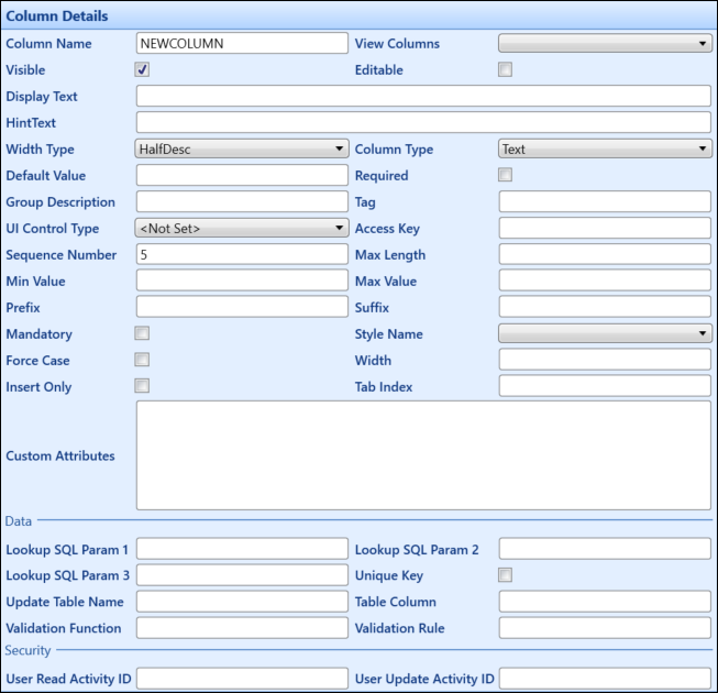
The fields in the Column Details panel are described in the following table.
| This field | Holds this information... |
|---|---|
| Column Name | The column name. |
| View Columns | The View Columns list gives you all available columns that can be added to the screen. These columns will be from the associated view with the page and only columns in that view can be used. |
| Visible | Whether the column is visible. |
| Editable | Whether the column can be edited. |
| Display Text |
The text that appears next to the column. Important.You can enter carriage returns in this column.
|
| HintText |
The text that appears when the cursor is moved over the column. Important.You can enter carriage returns in this column.
|
| Width Type |
The width type of the column. This is how the field will appear on the screen. Important.Some of the options may not function correctly in Central and Shape.
|
| Column Type | The column type. Select from the drop-down list. Column types can be defined on the Column Data Type tab. |
| Default Value | The default value that appears in the column. |
| Required | Whether the column must have a value input into it. |
| Group Description | The description of the control's group (if the control supports grouping). |
| Tag | Additional information that can be used on certain controls to influence behaviour (for example: certain fields can be enabled if an item matches the tag). |
| UI Control Type | The type of input control for the column. InputText is the type for a text field. |
| Access Key | This field is not applicable to columns. |
| Sequence Number |
The sequence in which the column appears on the screen. Important.This column accepts decimal points (for example: if you wanted your new
column to display after the second field on a page, you can set the sequence
number to 2.5 and the new column will be placed in between the second and third
fields).
|
| Max Length | The maximum amount of characters allowed in a column. |
| Min Value | The minimum value of the column. |
| Max Value | The maximum value of the column. |
| Prefix | Set text that goes before the column. |
| Suffix | Set text that goes after the column. |
| Mandatory | This field is for Tribal development use only. |
| Style Name | This field is no longer in use. |
| Force Case | Whether to force data entry to upper case. |
| Width | The width of the column. |
| Insert Only | Whether this column is only editable for a new record. If selected, the record cannot be edited once saved. |
| Tab Index |
Used to control tab order. Important.In general, this should be left blank as the client defines the tabbing order. However, this can be used to get around unique tabbing scenarios.
|
| Custom Attributes | Additional text that provides custom behaviour (for example: setting column colours). Refer to Custom Attributes - Columns for further information. |
| Lookup SQL Param 1-3 |
These fields are used in conjunction with the Column Type field to transfer additional data to a lookup control (for example: for Exam Category in Exam Details, the Column Type is Verifier and Lookup SQL Parameter 1 indicates the verifier type is EXAM CATEGORY). |
| Unique Key | Whether the column is the unique identifier for the row of data. |
| Update Table Name |
For a column that can be updated, this is the name of the table that this updates. Important.This is only required if it is different to the control update table name.
|
| Table Column |
The name of the column in the database Important.This is only required if it is different from the column name itself.
|
| Validation Function | A comma-separated list of numbers that is used for validating the data in the fields. |
| Validation Rule | This can be used to apply a custom validation to a column. |
| User Read Activity ID | This field is not in use for customers. |
| User Update Activity ID | This field is not in use for customers. |
-
Select Save .
Columns that have not been inherited from the base page can be removed from the inherited page. Columns that have been inherited (and therefore cannot be removed) can be hidden from view.
To remove a column from a page:
-
Select the column that you want to delete in the Page Controls panel.
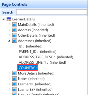
You can use the Search field at the top of the Page Controls panel to locate the relevant field. Entering a text string and pressing Enter highlights the results.
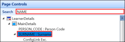 Important.Press Enter repeatedly to cycle through the results.
 -
Select the Delete button in the General group of the System Configuration Commands ribbon.

The Delete window is displayed.
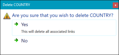
- Select Yes to confirm the deletion.
-
Select Save .
A control is a grouping of columns and links configuration with code (for example: on a page with a grid and a standard control, the name of the controls will be hard-coded in the coding of the page so that things are rendered correctly).
To add a control to a page:
-
Search for and select the inherited page you want to add a control to from the Pages list.

-
Select the page node in the Page Controls panel.
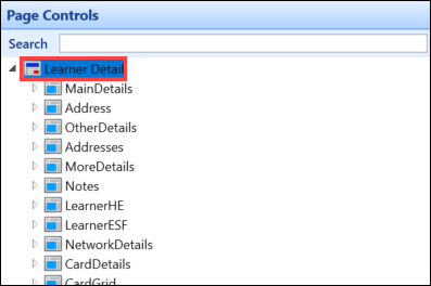
-
Select the Add Control button in the Page group of the System Configuration Commands ribbon.

The control is added to the bottom of the list of controls.

-
Enter the details for the new control in the Control Details panel.
The fields in the Control Details panel are described in the following table.
| This field | Holds this information... |
|---|---|
| Control Name | The control name. |
| ConfigType | The type of control (for example: a grid or a standard). |
| Visible | Whether the control is visible. |
| Title | The control title. |
| Header | The header of the control. |
| Footer | This field is no longer in use. |
| Width Type | This field is no longer in use. |
| Rows per Page | This field is no longer in use. |
| Start Pos | This field is no longer in use. |
| Height | This field is no longer in use. |
| Max Record Returned | The maximum number of records to be displayed (for example: on a grid). |
| Sequence Number |
The sequence in which the control appears on the screen. Important.This control accepts decimal points (for example: if you wanted your new
control to display after the second field on a page, you can set the sequence
number to 2.5 and the new control will be placed in between the second and third
fields).
|
| Custom Attributes | Additional text that provides custom behaviour (for example: to set column colours in grids). Refer to Custom Attributes - Controls for further information. |
| View Name | The name of the database view to select data from. |
| Order By | The way in which the data is ordered. |
| Update Table Name | The table name that any edits will save to. This is used to build configurable update statements. |
| Validation Function | A comma separated list of numbers that is used for validating the data in the fields. |
| Data Source Type | This field is not in customer use. |
| User Create Activity ID | This field is not in customer use. |
| User Read Activity ID | This field is not in customer use. |
| User Update Activity ID | This field is not in customer use. |
| User Delete Activity ID | This field is not in customer use. |
- Select Save .
Configurations are used to show different pages based on regions.
To add a control to a page:
-
Search for and select the inherited page you want to add a control to from the Pages list.

-
Select the page node in the Page Controls panel.

-
Select the Add Configuration button in the Page group of the System Configuration Commands ribbon.

The configuration is added to the bottom of the list of controls.

-
Enter the details for the new configuration in the Configuration Details panel.
The fields in the Configuration Details panel are described in the following table.
| This field | Holds this information... |
|---|---|
| Description | A description of the configuration. |
| Sequence Number | Where there is more than one configuration, the order in which they are applied. |
| Theme |
The theme. These are, in effect, regions. Important.There are different themes in Central, Shape and EBS4 web.
|
- Select Save .
Links are used to define linking controls (for example: ribbon buttons and context menus in Central).
To add a link to a page:
-
Search for and select the inherited page you want to add a link to from the Pages list.

-
Select the location you want to add the link in the Page Controls panel.
-
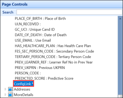
Select the Add Link button in the Page group of the System Configuration Commands ribbon.

The link is added.
-
Enter the details for the new link in the Config Link Details panel.
The fields in the Config Link Details panel are described in the following table.
| This field | Holds this information... |
|---|---|
| Link Type | Whether the link is a parent or child (for example: MenuNode) or carries out an action (for example: CodeBehind). |
| Display Text | The text displayed on the link item (for example: ribbon button). |
| Hint Text | The hint text displayed on the link item. |
| Access Key | The keyboard shortcut to access the link. |
| Imageset Name | This field is not in use in Central. |
| Navgraph Name | This field is not in use in Central. |
| Action Name | This field is not in use in Central. |
| External Name | This field is not in use in Central. |
| External URL | The URL, if the link is to an external website. |
| Link Operation | A description of the operation of the link. |
| Custom Attributes | Additional text that provides custom behaviour. For ribbon buttons, this field is primarily used to describe the placement and image used for a button. Refer to Custom Attributes - Links for further information. |
| Link Param Column 1-3 | This field is used in combination with the Link Operation field to provide sub-operation information. |
| User Activity Id | This field is not in customer use. |
- Select Save .
-
Search for and select the inherited page you want to add a menu item to from the Page list.
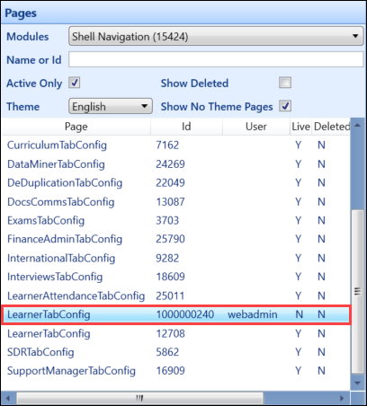
-
In the Page Controls pane, select the relevant node from the tree structure.
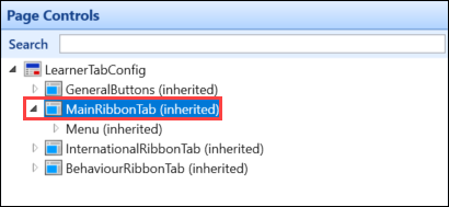
-
Select the required node to add the menu item to, and then select the Add Menu button in the Page group of the System Configuration Commands ribbon.

A new menu entry is displayed.
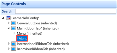
- Complete the Menu Config Details and Config Link Details sections as required.
The fields in the Menu Config Details panel are described in the following table.
| This field | Holds this information... |
|---|---|
| Width Type | This field is not in use in Central. |
| View Name | This field is not in use in Central. |
| Visible | Whether the menu is visible. |
| Node Type | A property that is used to describe the position in the control hierarchy (for example: start, branch, leaf and so on). |
| Sequence Number |
The sequence in which the column appears on the screen. Important.This column accepts decimal points (for example: if you wanted your new
column to display after the second field on a page, you can set the sequence
number to 2.5 and the new column will be placed in between the second and third
fields).
|
| Expanded | This field is not in use. |
| Order By | The way in which the data is ordered. |
| ImageSet Name | This field is not in use. |
| User Activity Id | The user activity ID, which is used to control visibility based on roles. |
- Select Save .
You can override the base behaviour at column level, if required. This allows you to hide columns, change labels, change hint text, alter the column order and so on.
To override base behaviour:
-
Select the column that you want to hide in the Page Controls panel.

-
If the column is inherited, select the green arrow adjacent to the relevant field in the Column Details panel. A green arrow indicates that the value is inherited from the base page.

-
Edit the field as required. The following example hides the column.

The green arrow turns red to indicate that the value has been overridden and differs from the base page.
 Important.You can select the red arrow to return to the default value.
 -
Select Save .
You can create a button which links to an external URL.
This will create a link via the button on the ribbon which will link to a URL to view relevant information (for example: to link to a college intranet). When entering the URL, a relevant parameter can also be entered (for example: person code), which is passed through when the URL is opened.
To configure a ribbon button to link to an external URL:
-
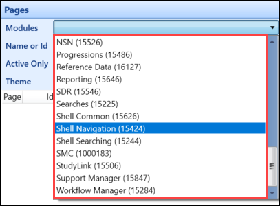
Select the relevant module (for example: Shell Navigation) from the Modules drop-down list in the Pages panel.
-
Select the inherited page you want to add an external link to from the Page list.

-
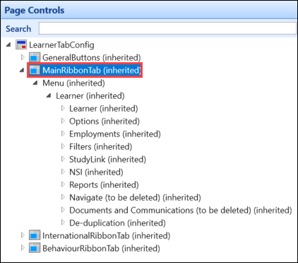
In the Page Controls pane, select the MainRibbonTab (inherited) node from the tree structure.
-
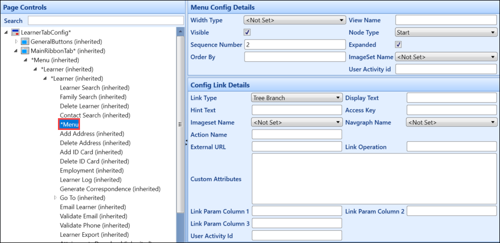
Select the required node (for example: the Learner node) to add the button to, and then select the Add Menu button in the Page group of the System Configuration Commands ribbon.

A new menu entry is displayed.
-
Complete the Menu Config Details and Config Link Details sections as required, ensuring the Link Type and External URL fields have the following values:
- In the Link Type field, select the External option
-
In the External URL field, enter the required URL, and then enter the relevant parameter (for example: http://intranet.college.ac.uk/)
You can also add dynamic content from the page to the URL, for example:
http://intranet.college.ac.uk/?person_code={LearnerDetails.MainDetails.PERSON_CODE}
Important.The format to enter a parameter is {screenname.controlname.columnname}.
- Select Save .
You can activate and deactivate pages as required, which allows you to revert to a base page if problems have been discovered with a configured page and to reactivate the page when amendments have been made.
To activate or deactivate a page:
-
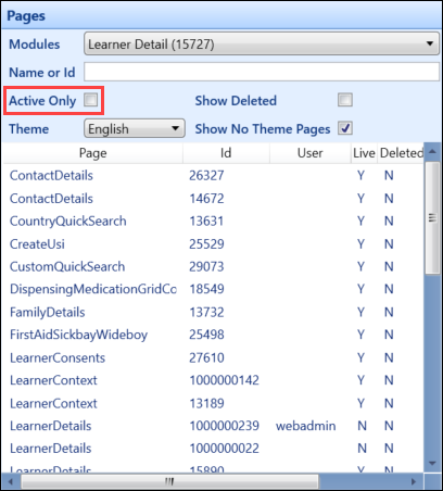
Deselect the Active only check box in the Pages panel to display both active and inactive pages, if required.
-
Select the page you want to activate or deactivate, and then select the Activate/Deactivate button in the Page group in the Configuration Commands ribbon.
Important.The button is only active when a page is selected.
The Confirm Activate or Confirm Deactivate window is displayed.
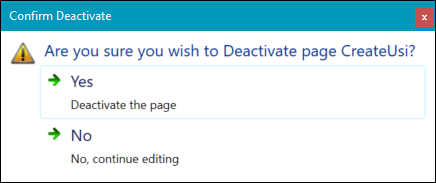
- Select Yes to confirm the activation or deactivation.
- Select Save .